

Brownie Lab — Interactive Portfolio
Powered by BrownieOS, a hand-drawn desktop interface for exploring projects, experiments, and the maker behind the lab.
Brownie Lab started as an illustrated portfolio experiment. The first version had a problem: a visitor could remember the cat without finding the work.
I redesigned the experience around three goals: make projects easier to discover, let direct links bypass the theatrical intro, and give desktop and mobile the same content with interactions suited to each. The result is seven content entries available on both desktop and mobile, directly shareable projects, and desktop windows with consistent behavior.
I owned the project end to end: concept, illustration, interaction design, frontend architecture, implementation, release, and ongoing refinement.
Project Brownie Lab interactive portfolio website
Stack Next.js · React · TypeScript · GSAP · CSS
Timeline Release baseline completed in July 2026, with ongoing refinement
Links Explore the site · View the code
1. The problem: turn an inviting world into reachable work
Much of my six-plus years of company work cannot be shown publicly, so Brownie Lab needed to show how I think through a product and carry it through to release. I illustrated a lab people could enter: a cat leads them through the door, they approach a computer, and BrownieOS lets them explore projects and the making process.
A prerelease review exposed a gap. The world looked complete, but the maker's introduction was buried in Finder, the Ideas icon did nothing, and some project evidence still used a mock interface. The portfolio needed to help a potential client quickly understand who made it, what had shipped, and how to get in touch.
What changed
- Entry paths: From relying on the full introduction to separate first-visit, returning, and direct-content routes.
- Project discovery: From hidden or unfinished entries to a complete Finder, Read Me, real product screenshots, and project links.
- Window behavior: From overlapping central windows with unclear hierarchy to shared management, stable cascading, and reliable dragging.
- Mobile content: From missing Trash and My Computer to all seven entries, with content shared across devices.
2. Product decisions: shorten the path from curiosity to evidence
Make the story an optional route
The first desktop visit keeps the click-driven introduction. Local visit state is saved only after someone enters the lab; returning visitors get a shorter Returning Hero, while project and window links open their content directly. I later made the returning door a two-step interaction: reveal a glimpse of the room, then enter.
This preserves the first visit's sense of exploration and gives returning visitors and project-link recipients a shorter route. Each entrance state needs its own verification.
Put the maker and shipped work within reach
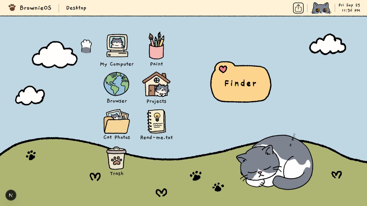
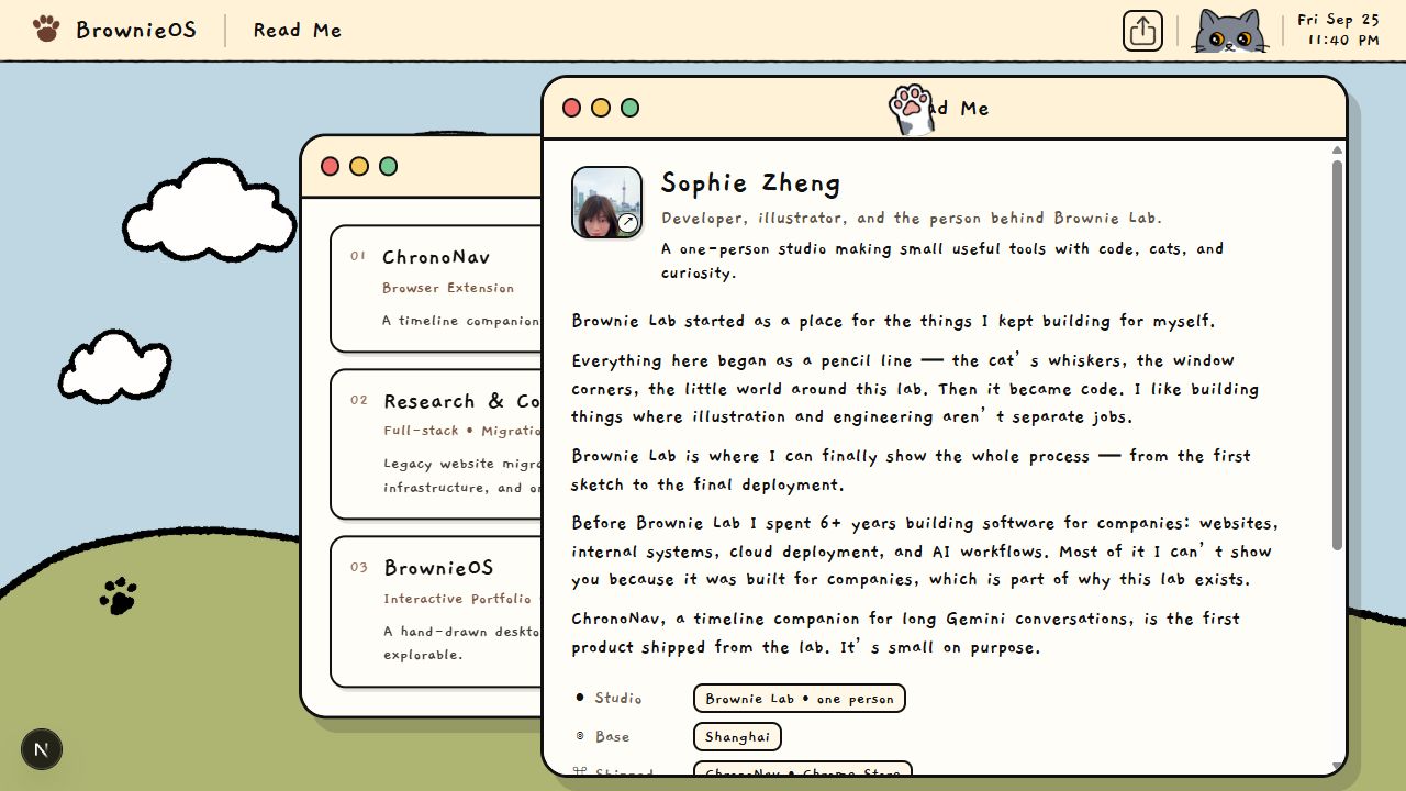
I replaced the inactive Ideas icon with Read Me, introducing myself through my name, released products, verifiable experience, and contact details. ChronoNav's mock interface became a real screenshot. Finder expanded from three destinations to all seven apps; Trash records discarded attempts, and My Computer explains the implementation.
The room's “Come see.” prompt stays visible and opens the computer. The first OS visit adds a one-time hint: “everything opens. even the trash.” I chose explicit cues over mystery when the hidden thing was evidence of the work itself.
Let sharing arrive at the visible content
Projects, windows, and the lab have copyable addresses. Desktop sharing targets the top window, mobile sharing targets the current page, and /lab shares the room view. A server-rendered identity statement, metadata, structured data, and a no-JavaScript fallback also expose the maker and work through ordinary web entry points and search previews.
3. How it works: keep windows, navigation, and URLs in sync
GSAP handles the fixed intro timeline; React state and CSS transitions handle navigable interface states. This separation keeps animation timing independent from back navigation, deep links, and window state.
All apps use one window manager: clicking brings a window forward, Esc closes the top one, opening moves focus inside, and title bars support dragging. Finder serves as the index and asks the manager to open content, avoiding a second system of nested windows.
Two interaction problems drove further changes:
- A second window looked like it replaced the first. I added a fixed cascade offset calculated when a window opens, so bringing it forward does not move it. Positions reset between visits to avoid restoring windows offscreen on a different viewport.
- Dragging stopped when the pointer left the title bar. I moved the move and end listeners to document and paused pointer events on underlying targets until the drag ends.
The URL follows visible state, and direct links restore the corresponding content. Leaving BrownieOS clears the window stack and restores the appropriate address, keeping shared links aligned with what the visitor sees.
The artwork also uses a layered canvas with shared coordinates, keeping characters, doors, screens, and interaction targets aligned. Proportional coverage allows edge cropping, while separate layers support synchronized typing and screen changes.
4. Mobile strategy: share content, redesign the entrance
Phones use a still room scene, an app grid, and full-screen content pages. Miniaturizing the desktop would leave small targets and dragging that depends on a precise pointer. The grid can serve as the index directly, taking over Finder's role.
The first mobile version omitted Trash and My Computer. I extracted content from the window shells so desktop windows and mobile pages could reuse it, then connected all seven entries. This preserves content parity while allowing different navigation. Mobile also hides the irrelevant “open windows” count.
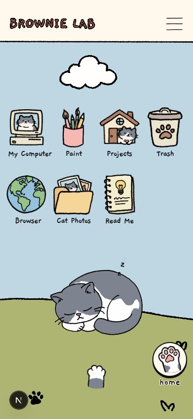
Icons changed from uniform colored plates to seven transparent hand-drawn exports sized for the grid and screen. I also tried CSS outlines, but they did not fit the artwork, so the original linework remained. Mobile assets are maintained separately from the desktop canvas for better cropping and touch layout control.
5. Outcomes: work that can be reached, opened, and shared directly
- Direct project links bypass the intro, and returning visitors have a shorter entrance.
- All seven content entries are available on desktop and mobile, with shared content components.
- Desktop windows share stacking, dragging, and deep-link state management.
- Share actions resolve to visible content, and the lab has its own address.
- Server-rendered metadata, identity text, and fallback content support access beyond the interactive scene.
The July 29, 2026 release baseline passed type checking, linting, and a production build generating 10 static routes. Its 390px page check found no horizontal overflow or console errors. Metadata, the Open Graph image, robots, sitemap, and the no-JavaScript fallback were also checked.
This case study documents implemented behavior and verified release checks, not audience-level conversion claims.
6. Tradeoffs & next steps
- Story and efficiency: Keep the first-visit introduction while maintaining return and direct-link routes for different visitor intentions.
- Composition and adaptation: Accept cropped illustration edges to preserve alignment between artwork and interaction targets.
- Loading and visual order: Reject deferred Intro image addresses after decode order disrupted the storyboard. The next loading experiment should measure benefit and wait for each stage's resources before revealing it.
- Desktop and touch: Maintain two interaction shells and separate icon exports, using shared content to keep the experience consistent.
- Next validation: Observe entry discovery and touch accuracy on real phones and touch-screen laptops, then refine accessibility, image weight, and the making-process view in Paint.
A story can invite someone in, while projects, identity, and contact paths still need to work when a visitor skips the story entirely.
Sources: architecture, storyboard, release review, window and mobile development note, and rejected image-loading experiment.